WonderWoof - A Summer of UX Research
WonderWoof, a pet tech startup in NYC, makes activity monitors for dogs (in the shape of BowTies!). Neither one of us knew what to expect when I came calling. We both learned a thing or two through exploratory research. Here's a peek at my side of the story...
My Role: I tackled some market research and played a major voice in front lines customer service, but my jam was digging into the user experience through research and usability testing.
Problem
Customers continued to express frustration with the device since the launch of the product.
Opportunity
Understand why user discomfort occurred, so improvements could be made.
Solution
Quantitative analysis of the support ticket history & qualitative cognitive walkthroughs
Lessons Learned
One man research teams are lonely.
The leap from research to developing solutions is a big one.
PROCESS
The story of my summer at WonderWoof can best be narrated by breaking it up into two segments: Customer Service Exploration + Targeted Usability Study.
Customer Service Exploration + Targeted Usability Study
The first half of my summer was spent acclimating to the daily punches of the startup craze and exploring my role on the team. As I analyzed the current state of our customer experience, I used my findings to inform a further, more structured usability evaluation.
Customer Service Exploration | crunching the numbers on current support tickets
My first glimpse into our usability challenges started by manning the support portal for our customers. I took up the face of customer service agent and communicated directly with frustrated customers as I began acclimating to my new environment. Several customer service blogs later about proper tone, active voice, and establishing empathy, I started picking up on the whispers of trends across customers.
They were having trouble signing in and out, even if they'd already made an account. Data wasn't logging properly. How did they know if the product was on?
With these whispers in mind, my first plan of action was to do a quantitative and qualitative aggregate exploration of our support ticket history to start validating my internal assumptions (some of these assumptions were based off of my own experience setting up the app).
After pouring over 305 independent tickets submitted from Nov. 2015 to June 2016 and coding them with different tags and descriptors, the landscape of user submitted support problems fell into two categories - technical issues supported through quantitative data and user experience opportunities for improvement (supported through qualitative data).

Zendesk Portal - Customer Service Agent GUI

Technical Recommendations based on Quantitative Data
These findings were presented to our team and we started designing solutions and prioritizing problems. Some problems were low-hanging fruit that the development team tackled independently and immediately. Others were bigger bugs or inefficiency in the code, but now identified problems that could begin to get solved. One time-consuming problem I had the opportunity to assist with was FAQ language and design across the mobile app and website. The re-design of this area of our product was challenging and took into consideration the design of language or communication but also the usability of FAQs in general. We looked into the pros and cons of accordion menus, search bars, how to categorize different topics, etc. We also supplemented our own internal research findings with external studies on FAQ Usability and competitive analysis of other companies' approaches in our industry.
Targeted Usability Study | observing hurdles for first-time users through cognitive walkthroughs
The next step in my UX journey for WonderWoof was to perform task-based cognitive walkthroughs of the app with UX professionals. This decision was guided by our insights from the Zendesk Research above, but also by my white-glove interactions with Puppy Influencers that visited our office.
As the resident UX-er and customer support agent, when we invited pup celebrities to the office, I owned the on-boarding process. When the pup's owner visited the office, we often had a photo shoot and then gifted the pair a BowTie. At this point, the owner would download and begin setting up the device in our office. The clinical UX-er in me tried to be more observational during these encounters, watching as the owner set themselves up, but often times I would step in when I could feel the frustration building so that the owner didn't become too uncomfortable. It wasn't the most unbiased observational method since these dogs has followings of 5,000+ Instagram followers and required a certain level of grooming from a marketing perspective. So while, I tried to balance the clinical contextual inquiry model, I couldn't let our guest get too frustrated. These semi-observational instances began to verify similar challenges I had experienced myself and support that further testing needed to be done.

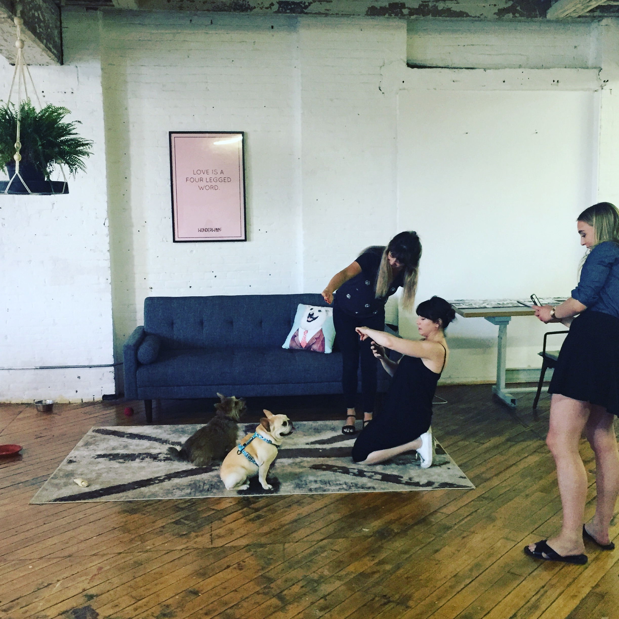
That's when I encouraged the team to try cognitive walkthroughs. With their support, we reached out to three other Georgia Tech UX students working in NYC to give their expert opinion on the new user on-boarding experience. Each session was roughly 1 hour long, involved a set of 12 tasks from logging on to the app, creating a profile, and setting up the bluetooth connection to taking walks with their imaginary pup, setting feeding time reminders, and making friends with other dog owners in the area. Each session was video recorded to capture the tester's facial expressions. We also took screen recordings of the app and administered an exit survey.

Cognitive Walkthrough in Progress

Cognitive Walkthrough Instructions
After gathering the data, I took the train back to the office and spent the next week pouring over the videos and building an affinity map of our findings. Following the affinity map, we had a debriefing as a team where I presented findings and we began brainstorming solutions.

Affinity Map of the Cognitive Walkthroughs
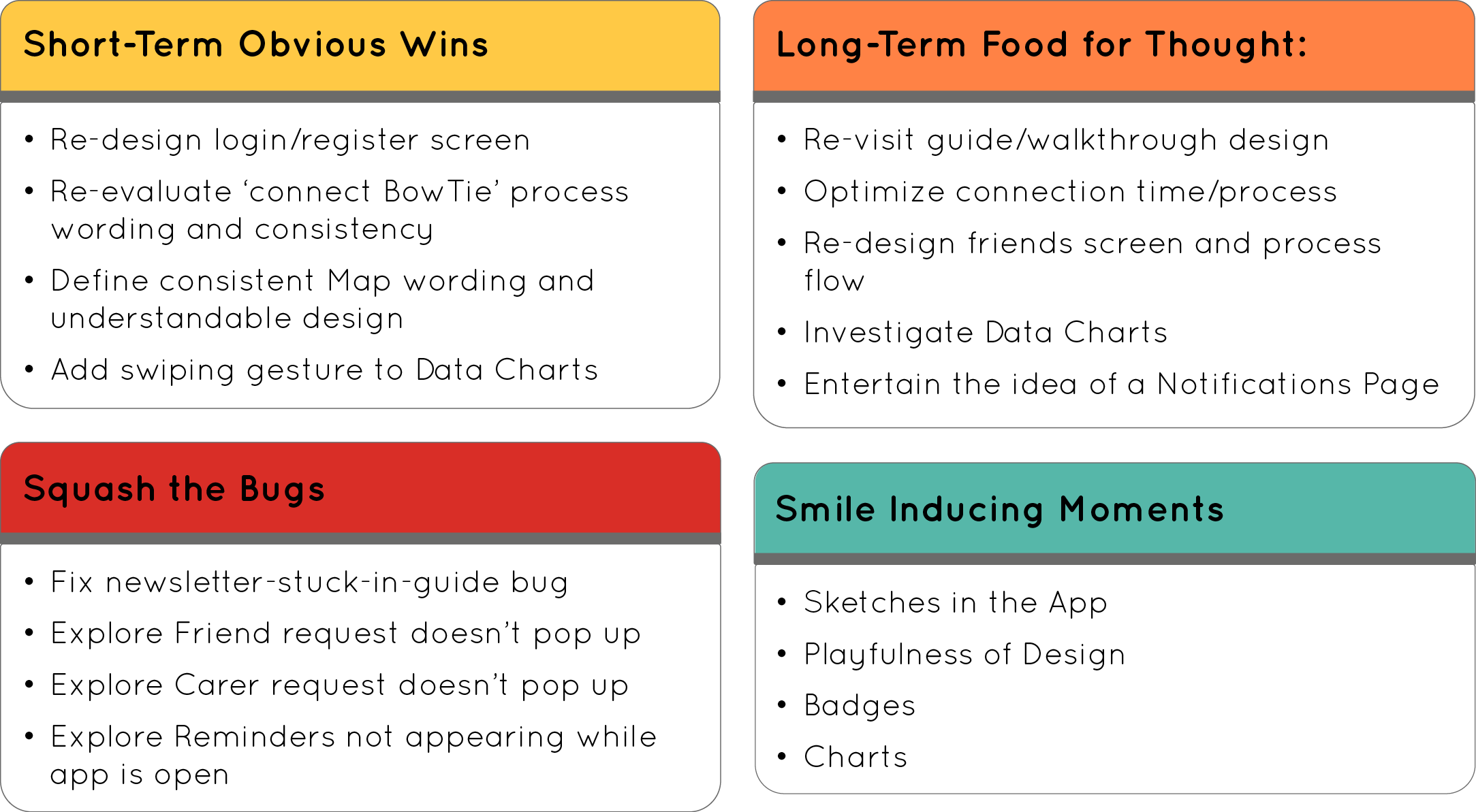
Recommendations following the study to inform Brainstorming
Looking Forward and Lessons Learned
The final two weeks of my internship, I spent cleaning up some low hanging fruit through low-fidelity wireframes and documenting our findings for future team members.
As I reflect on my summer, I appreciate the opportunity to organically explore our product's environment and identify user problems that are supported by findings. I learned quickly, though, not to take for granted that UX thrives in team based environments. Working on your own without others to bounce ideas off of or rubber-duck is difficult. Even the odd session or two where you can grab other members of the team and ask them to put on a quick UX hat is few and far between. You have to learn how to be self-critical or "kill your babies" as Stephen King would say, because there is no one else to interpret another side to the story.
The second take-away has more to do with the next step after research - delivery & implementation. My summer was defined by research and involved heavy communication directly with the development team. However, despite the difficulties associated with geographically separated teams, handing off research and making design change recommendations is not an easy task and one I had to learn along the way. I'm by no means an expert on it now, but can confidently say I could do it again - I'm learning to speak their language more and more and look forward to putting myself in that position more often on other projects.